


Linking Hearts to Homes with PAWsitive Impact
PAWsitive Impact is a social cause app designed to support animal rescues and shelters, connecting them with animal lovers who want to volunteer or donate.
Project Details
My Role
UX Researcher, Visual Designer, & Interaction Designer
Tools
Figma, Adobe Illustrator, Adobe Photoshop
The Problem Space
Animal rescues and shelters often struggle with limited resources, low visibility, and a lack of consistent volunteer and donation support. At the same time, many animal lovers are willing to help but lack a centralized, accessible platform to discover opportunities for volunteering or donating. This disconnect hinders the effectiveness of rescue efforts and limits the potential for community involvement in animal welfare.
PAWsitive Impact addresses this gap by providing a dedicated app that connects animal shelters and rescues with individuals who want to contribute their time, resources, or support.
Current Solutions
GiveCloud
QGiv
Bloomberg


Discover
User Research
Empathy Mapping
User Persona
Scope
March 2024 - November 2024
Methods
User Research, Competitive Analysis, Heuristic Analysis, Information Architecture, Visual Design

Competitive analysis revealed that GiveCloud, QGiv and Bloomberg are common website integrations that rescues use to manage their donations through their site.
Heuristic analysis revealed that these popular options succeed at providing rescues and shelters with donation management, but lack anything volunteer related and the interface is only for the rescue side. There was a lack of usability for a ‘regular animal lover” that wants to help. This is where PAWsitive Impact comes into play.
User interviews played a vital role in determining what motivates users (that are animal lovers and rescue workers). Five participants were interviewed and asked questions that helped me understand the process they have used to donate to shelters and rescues alike. There was a lack of anything centralized as the users had to go through the shelter’s website or personal social media page. This helped me see the overall lack of a centralized space.


The user persona served as a reference point throughout the process. It combined the needs and wants of all the participants interviewed into one and ensured those needs remained the top priority.

How might we…?

With the help of the Empathy Map and User Persona, I created three questions to help me stay focused on the needs of the user as I progressed toward the design of my prototype.
How might we make the process of donating to animal shelters easier?
How might we streamline shelter donations?
How might we increase the number of donors an animal shelter or rescue gets?
The goal of PAWsitive Impact was to address these questions and be a solution.
Develop
User Flows
With a user flow, I had a better understanding of how my designs would appear before I had even begun sketching. The Information Architecture was created at this stage and helped organize what see what screens would be needed in order to create the “animal lover” side to the app.
User flow would need to include:
An account creation that had the step-by-step process for both animal lover and rescue accounts (with the animal lover one being able to be finished)
A profile for the animal lover
A feed for the user to scroll through
We ended up with a following and discover option
A map for rescues to be able to be discovered
A card/payment set up for donations
A rescue profile
A messaging area to continue to build a community

Sketches

With the user flows, I created low fidelity sketches that answered the “How might we” questions. These designs were created with the needs of the user in mind and what came out of the user flows.
Brand

The PAWsitive Impact logo was intentionally designed with personality and character to stand out from the current trend of minimalistic logos. The tagline, 'Linking hearts to homes,' perfectly captures the brand’s mission and emotional connection to its cause.
Color Palette

The color palette was designed to be bold and eye-catching, complementing the strong personality of the logo. It also adds a fun and engaging feel to the application, enhancing the overall user experience.
Typography

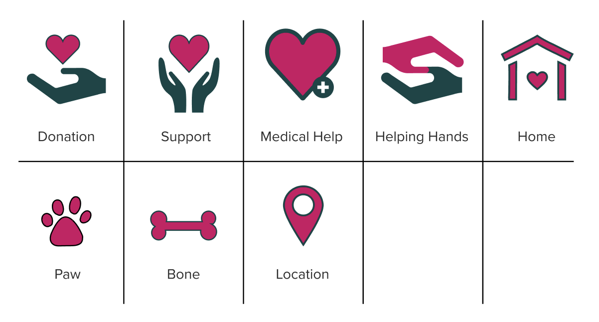
Iconography
UI Elements

Photography
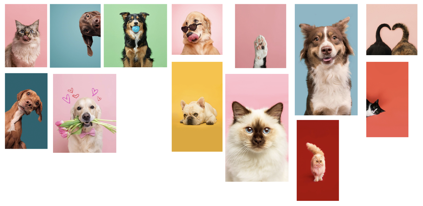
The bold and vibrant photography aligns with the brand’s tone, aiming to create a fun and engaging atmosphere. Unlike the typical rescue imagery that often focuses on sad or distressed animals, this approach brings a sense of joy and positivity—reflecting the passion users have for their pets and the hopeful outcomes the app strives to promote.
High Fidelity Mockups
With the research and branding PAWsitive Impact was ready to come to life with high-fidelity mockups for the usability testing.

Usability Testing
First Round Testing Findings
Overall the first round of testing went well and revealed some key findings:
Overall positive reception on the brand and logo
positive, gives hope, eye catching
A couple of places where the app didn’t connect (missing location services, CTAs, etc)
Overall easy to use and navigate
Second Round Testing Findings
Testing went well and there were no links missing
Had to clarify that the side of the app is designed is the “animal lover” side and not the “rescue” side
With this the thought of having to have an email feature that sends the rescue a verification email upon applying would need to be implemented
Reflection
The UX side of this project was definitely a long and challenging process, but also one of the most important. It pushed me to really think like a user, anticipate their needs, and design with empathy. Getting into that mindset helped shape a product that feels intuitive and meaningful.
That said, I’m a designer at heart, so diving into the UI phase was where the real excitement kicked in. Bringing everything to life in Figma after all the research was incredibly rewarding. Iterating and refining the design helped me catch areas that needed more clarity or attention, and it really sharpened my problem-solving skills.
This project was a turning point for me. It not only grew my abilities but reminded me exactly why I love UX/UI design. I’m excited to keep pushing forward and bring this same passion to future work with teams who care about thoughtful, impactful design.